Aki Rautio
Document and test a common component library
July 24, 2020
Earlier in this series, we have gone through how to create your component library with different methods. Besides the tools to create the components themselves, documentation and testing create a lot of value to your library.
Components in React consist of three ideas; understanding each state of the components, understanding the transitions between different states, and understanding the interaction in a component.
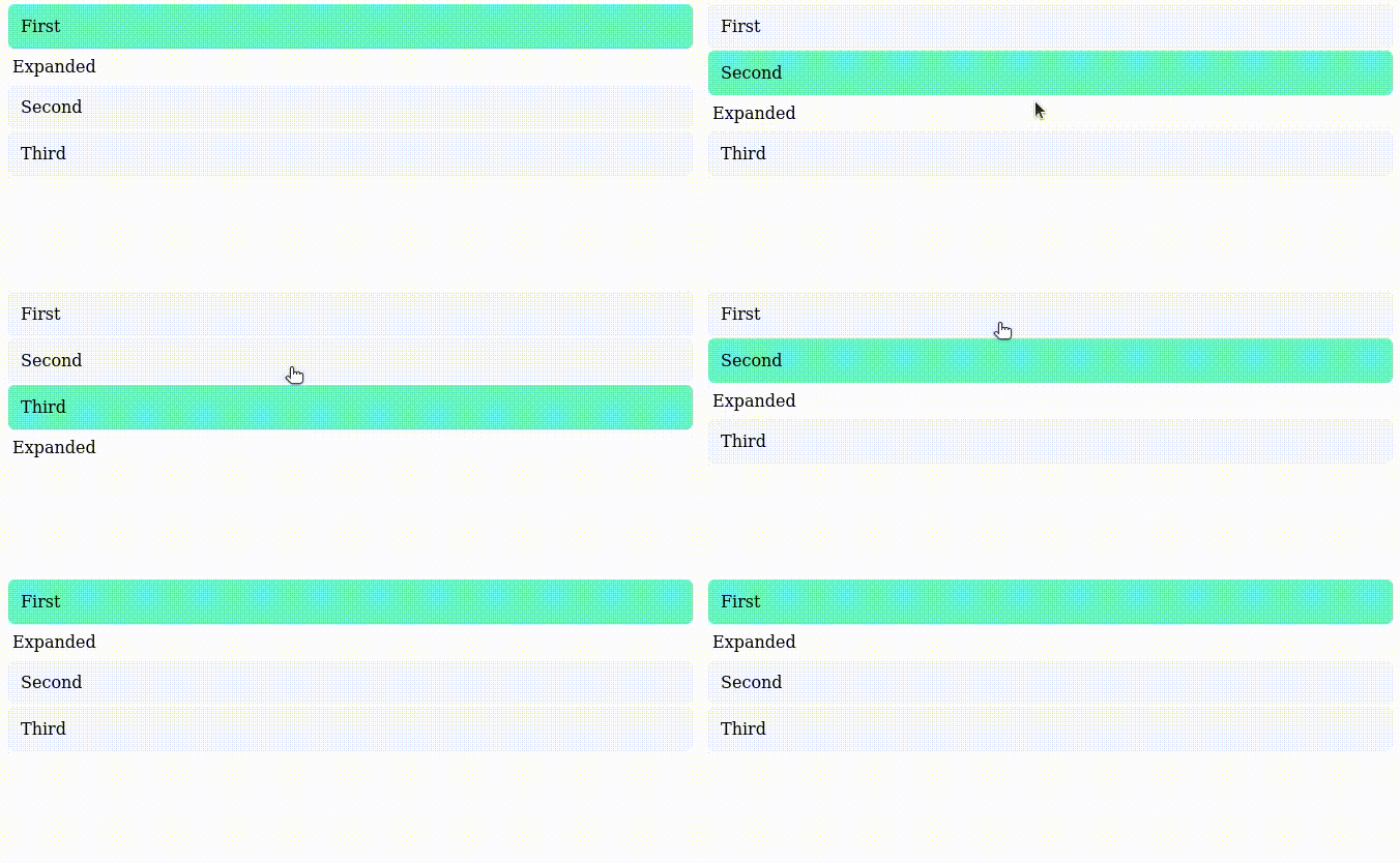
For example, an Accordion component has two significant states, either one of the items is opened or we don't show any open items. Closing and opening the item can be animated which creates a transition between two states and interaction generally is done by clicking the header of the item.

Developing the following kind of a component can be done straight at the spot, but testing all states from the components can be a bit tricky in that specific spot especially if it connects with external data. Luckily there are a lot of isolated development tools that help to show all the states at once and even check whether there are any changes to all those states between commits. Combining these two features makes component development a lot more reliable and faster.
One of these (and probably most popular) isolated development tools is Storybook. While there are other choices available (like Styleguidist and React-Cosmos), Storybook combines both documentation in an isolated development environment and testing the changes between commit to the package which works pretty well and is relatively easy to set up.
Creating stories to cover all the states
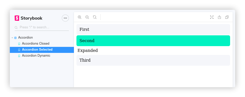
To speed up the development, you can create all the key states in Storybook and write your components based on them. In our Accordion example we defined, two states; one opened and all closed. Writing them in the storybook would look like this.
Besides these two, we probably would like to try out the interaction to ensure that it works correctly and transitions look good. So we could also add the controlled version from the Accordion.
This all will create pages in Storybook which one can go back forth depending on which state is under development. For example, changing the color of the selected item would be easy to check out from this particular view.

Storybook also offers better documentation and component property listing which brings the documentation even more available for everyone. In our example having the list of states and a dynamic component is enough since we are focusing on speeding the development and checking the states. If you would use this for documentation it would be good to add documentation of the properties and some text how the setup works.
Testing
Testing in Storybook can be done a couple of ways, either by generating a text or image snapshot from React components (Storyshots) with Jest and comparing it to the latest version. Both of these have their caveat points, but in general, they help to recognize unwanted changes.
When using text snapshots with Storyshots, the test generates a snapfile from the story and compares it with the previous version to see if there are any changes. If you have added all possible states to the story, only transitions and integrations need to be tested out anymore. While snapfile makes it easy to see which components are changing, they generally don't provide a too good experience to understand what has been changed.
Image snapshot with storyshots-puppeteer is one level higher from text snapshots because it compares generated images instead of the code. This gives a much easier way to see those differences but it also will give more false positives. Every time the code is generated to html page, there might be some 1px changes that trigger the change so the threshold needs to be defined properly. The positive side of the false positive is that they are relatively easy to check since test produces a visual diff.

Covering all the key states of the components inside storybook and adding storyshots or storyshots-puppeteer to test those states, will ensure that you don't get surprised by changes. It also enables you to focus on testing the interactions and transitions between interactions with other methods (like Jest + react-testing-library) which saves your time.
All this doesn't come without some costs because running all the tests will take significant time. In one of my applications, the total running time for roughly 1000 tests is around 4-5 minutes. It would be advisable if possible to run these tests within CI/CD so that they won't block you from writing the code.
Another unfortunate challenge with snapshot testing is that they are done in isolation. This means that even though you had covered all the states of the component, it still may fail in your application because you didn't take into account it's surroundings. For example in one of my applications, the ID of the component overlapped with other components and showed the component differently than in Storybook.
Both image testing and filenapshot testing also fail to show any issues with a specific browser because they are only focusing on either code or chrome. For multiple browser testing, there are extended tools like Chromatic but they certain are not foolproof either.
Summary
Documenting and testing React components in isolation eases up development because you are more aware of the changes that are happening to your components and you can faster check each key state of the component. Storybook is a compelling option for documentation and testing because it enables you to create all these states fast and has a possibility for automated tests without too much hassle. If your components are changing, the tests will notify you even when you wouldn't notice. This all though doesn't come without cost. Tests take a while to run and isolated development doesn't take into account it's surroundings. Unfortunately, the design testing only happens inside chrome but understanding the biggest effect usually is enough.
If you want to check the code by yourself, the working demo is in my common components repository.
Comment or ask about the post in Dev.to